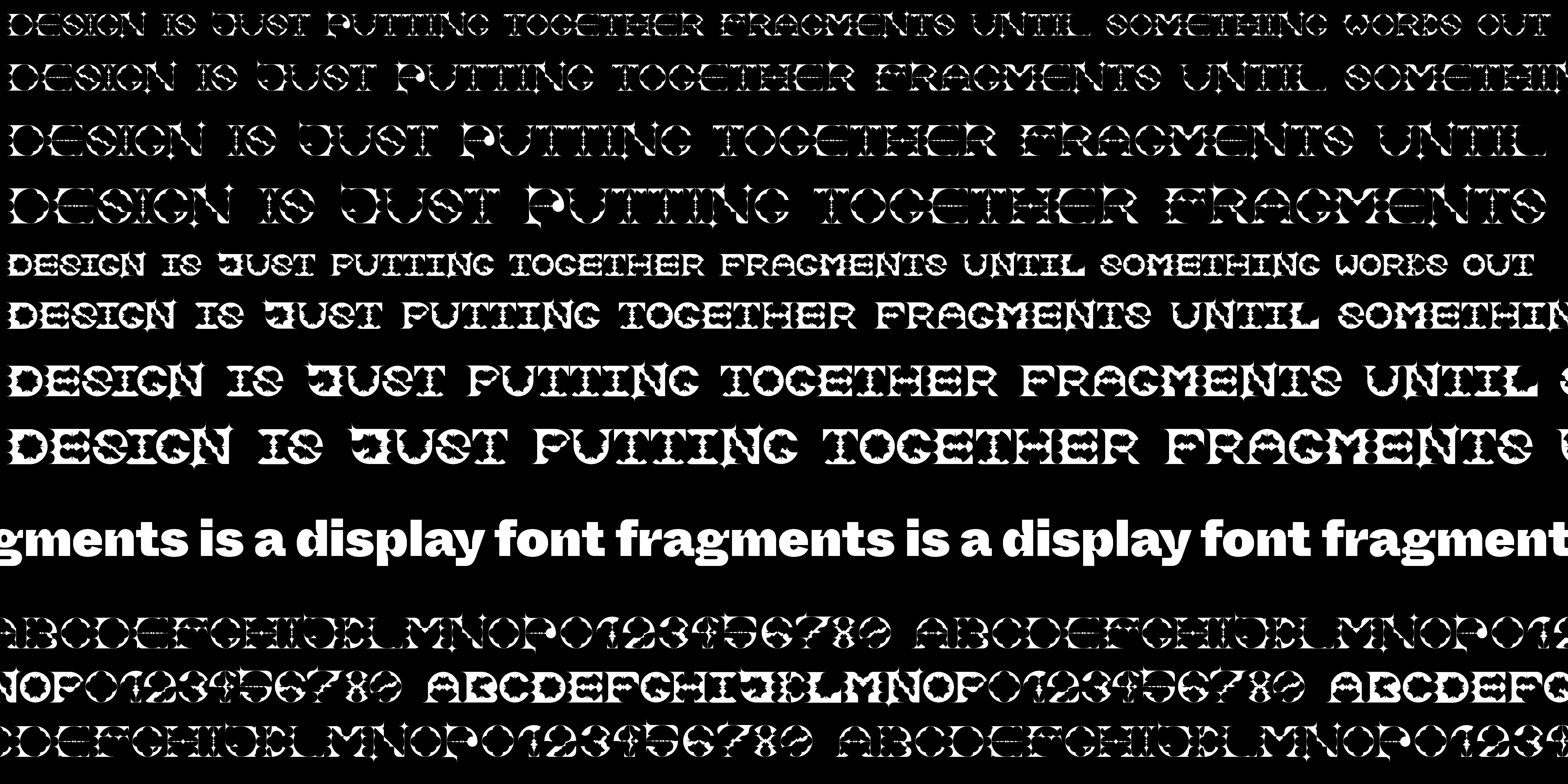

This was a project for my university. The task was to design a font based on a grid of our choosing, tied to the overall brand identity of a fictional typography festival.
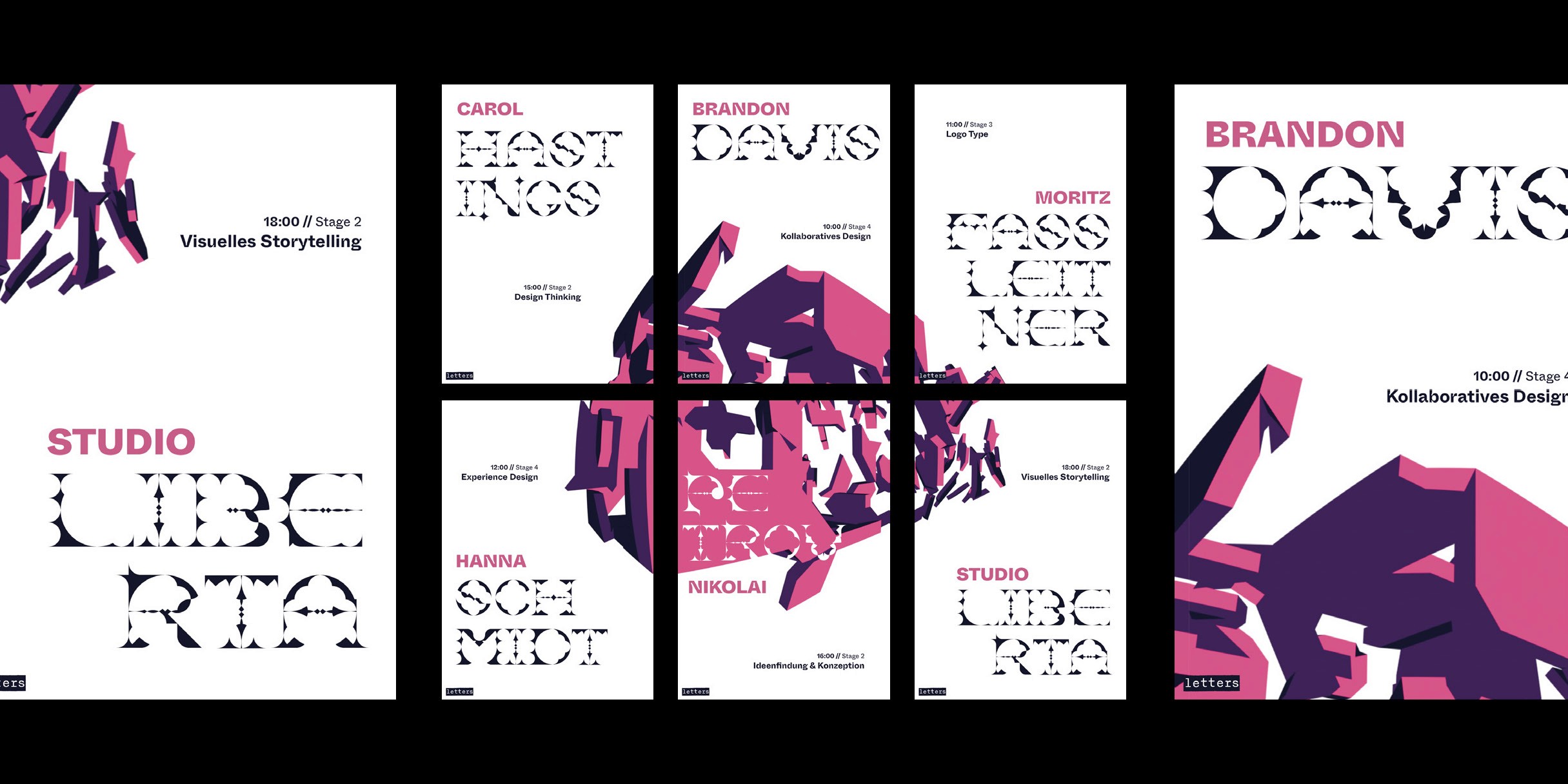
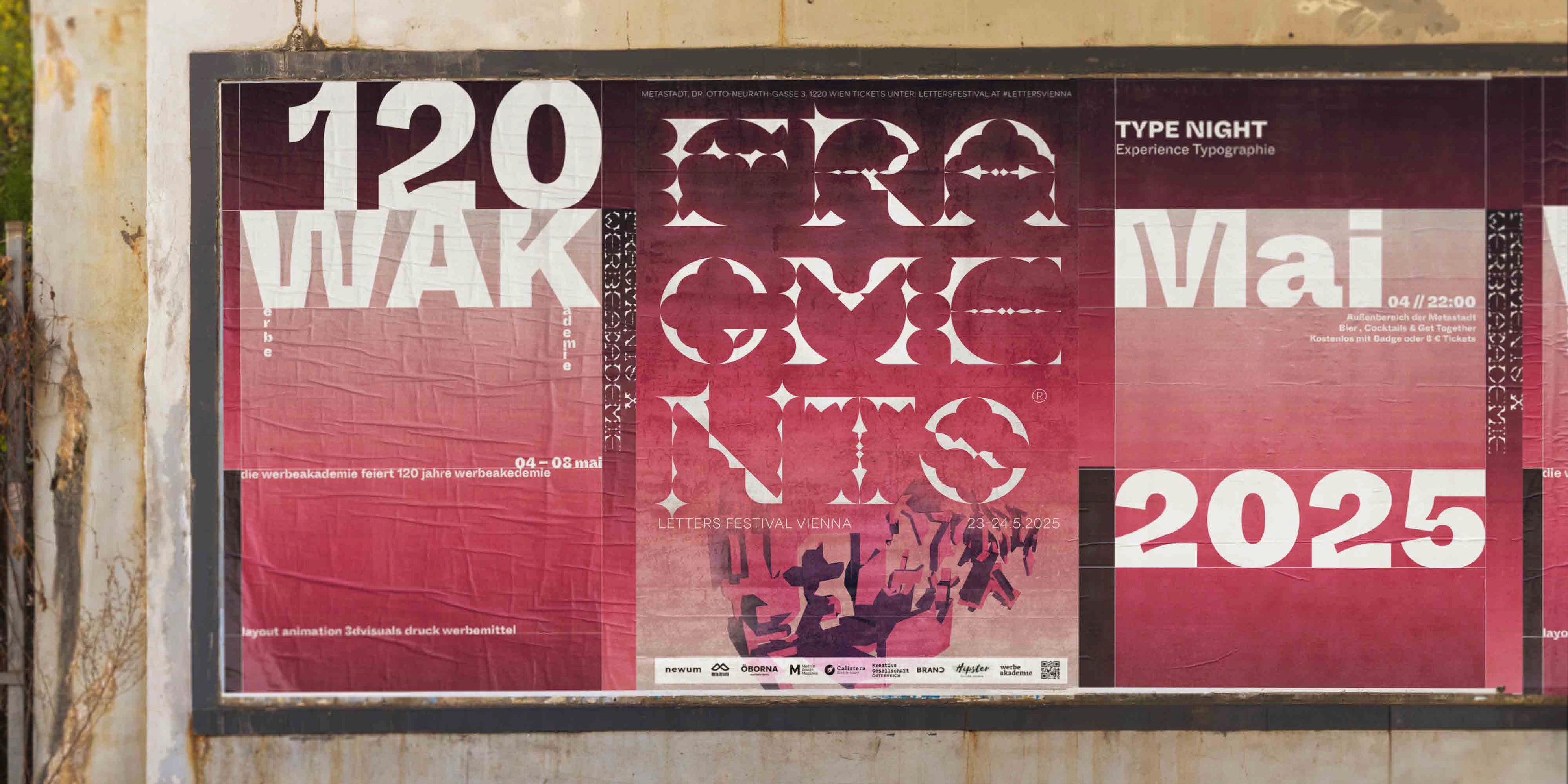
I approached the project by developing a custom grid that became the structural foundation for both the typeface and the wider visual system. Using this grid, I designed a modular, fractured font composed of repeatable geometric elements, allowing each character to feel both constructed and slightly disrupted. This balance created a distinctive visual rhythm that acted as a unifying “glue” across all applications. Paired with a grid-based layout system, the overall identity gained a sense of flexibility, able to adapt and reconfigure depending on the festival’s needs while still maintaining a cohesive look.
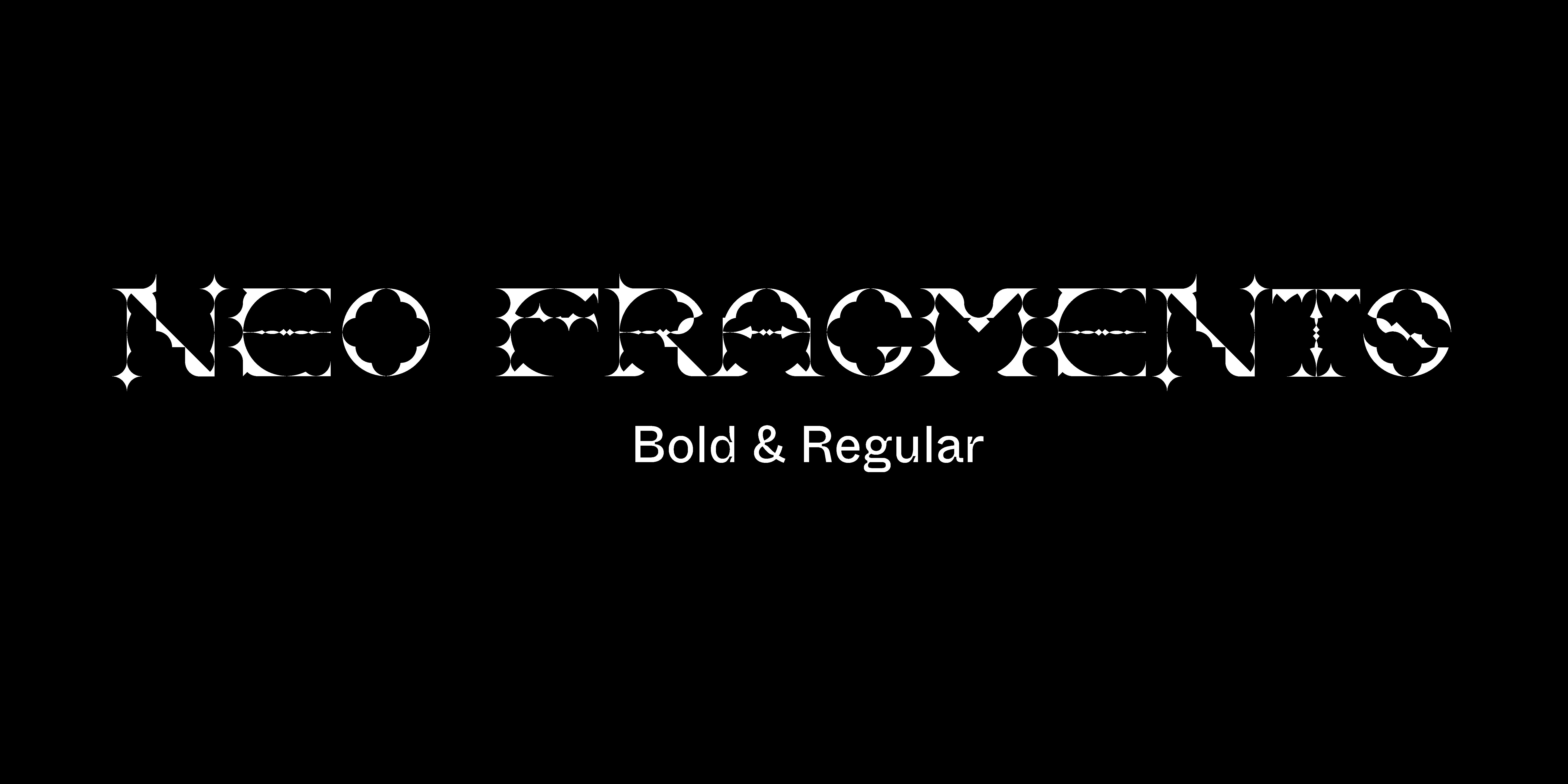
Download Neo Fragments

